Photos: Colours of London

Very Red Café
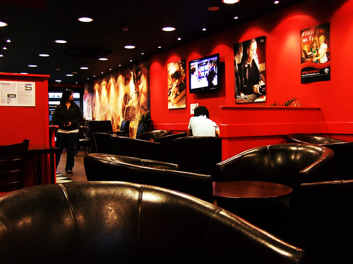
Red: At a café in West Kensington.

The Headless Horseman :D
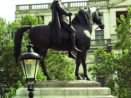
Green: A headless horseman! (ha ha :D)

Lord Nelson
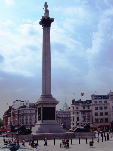
Blue: Nelson’s column in Trafalgar Square

As some of you might know, I travelled to Europe (specifically, England, France, Italy, and the Netherlands) this past May and June. I am just starting to process the photos, and what a daunting task it’s proving to be! Digital photography is convenient and cost effective (no more wasted film!), but also opens up the possibility of taking thousands of pictures that you’ll never have time to edit. I’m really enjoying going back over the photos, though, because they remind me of my awesome trip that now feels like a crazy dream. I was only in London for two days (tragic!!!) so that part of the trip really did go by in a whirlwind! More travel pictures are available at my flickr.

♥ Dara.

Another Printing Press Poster Design

Smiling Buddha Poster 1

Here is another poster that I designed for a Printing Press show earlier this summer. I made this poster long before the last one I posted. In retrospect, I should have posted this one first and the other one second. Shhh, don’t tell anyone!

♥ Dara.

SPÖKA: The ghost with the most!

Since I started my blog with the intention of writing about all things art, design, and aesthetically pleasing, I figure that it must be appropriate to write a small homage to a new friend of mine that I picked up at IKEA this past weekend.

spoka-off

His official name is Spöka and I found him in the Kids’ section. He’s a rechargeable nightlight in the shape of an adorable ghost! He comes in three colours: blue, red, and green. Although red is my favourite colour, I opted for the blue one since he was the very cutest. I like design that’s not just functional, but creative and good looking as well.

spoka-on

Although IKEA is not to everyone’s taste, it’s one of my favourite places to spend a free afternoon. I love interior design and home decor! Strolling through the showrooms, I imagine what my future home will look like. I enjoy the mix of classy, kitschy, and downright tacky items for sale. I also find it amusing how design trends, much like everything else, are cyclical. When I was younger, I always used to make fun of a rather hideous lamp in my grandparents’ house that looked like it came right out of the ’60s or ’70s… that is, until I saw IKEA selling it as the “KNAPPA Pendant lamp”. Oops?!

Anyway, back to my new little friend. In the following picture, he comes face to face with one of my favourite artists – Toulouse-Lautrec!

spoka-toulouse

♥ Dara.

Printing Press Poster Design

Hello, Internets!  Sorry I’ve been a bit absent lately.  This September I’m starting graphic design courses, and lately I’ve been practising my skills.  My most recent project was to design a concert poster for The Printing Press for their show on August 22.  I have to admit that I often have trouble pulling random ideas out of the air, so I went with a motif that was close to my heart:  cameras!  I actually don’t own a Diana camera myself, but I like the way they look and the weird, dreamy, crappy-but-cool images that they tend to produce.

Poster 2

Since I was to create a concert poster and not a camera show advertisement, I put a little something, also known as a (bass) guitar, in the camera lens.  I also had fun with the halftone look of the camera.  I’m really interested in learning more about screenprinting, and I’ve always liked the aesthetics of something that’s been printed in overt, visible halftone.  I plan on experimenting with that more in the future, hopefully culminating in learning how to screenprint for reals.  In the meantime, I print my own stuff (t-shirts mostly) by stencilling, and I’ll write more about those projects in an upcoming post.

Photos: High Park Noir

Old school

Sometimes, there’s something to be said for imperfection.

Although I get (usually) crisp, clean images out of my digital cameras (except in low lighting situations where I stubbornly refuse to use the flash), there is something to be said for the grain and noise and imperfection of pictures that come out of a film SLR. Now, these images are more speckled and worn-looking because they were developed at home and I’m not exactly the most skilled film developer, having never taken photography in school. My brother and I use a bathroom with no windows to develop our rolls of film, and block off the light coming through the door with a blanket, hoping it keeps light tight. It’s a lot of fun in the end, though it’s a bit time consuming and frustrating when you’re trying to open film canisters and load film onto spools in the dark! After we’ve developed and washed our film, we scan it and then deal with the images on the computer. Somewhere along the way, a bit of dust and scratching made their way into the final product, but I think it adds something to the old look of the photos. These photos look like they could have been taken decades ago, instead of within the year. I love film for totally different reasons than I love digital cameras, in the same way that I enjoy vinyl but mostly listen to MP3s in reality.

High Park Noir

High Park Noir

Speaking of film, I’m quite sad that Polaroid is stopping production of its film sometime this year… it’s time to stock up! :( I hope that another company will keep producing the film so that I can freely use my Polaroid camera (a $6 Value Village find!) without wondering if the shot I’m taking will be my last.

♥ Dara.