Design to Code is a collaborative blog column where awesome graphic designer Alicia Carvalho will teach you about a design concept and related tips, tricks or resources, and then I’ll tell you how it can be applied to the web. This week is all about colour!
 Alicia says…
Let’s talk about colour! I believe everyone is familiar with the basics of colour wheels so I will jump right in and explain how colour works in design from a printing perspective, how it translates onto the screen and then Dara will continue the online exploration.
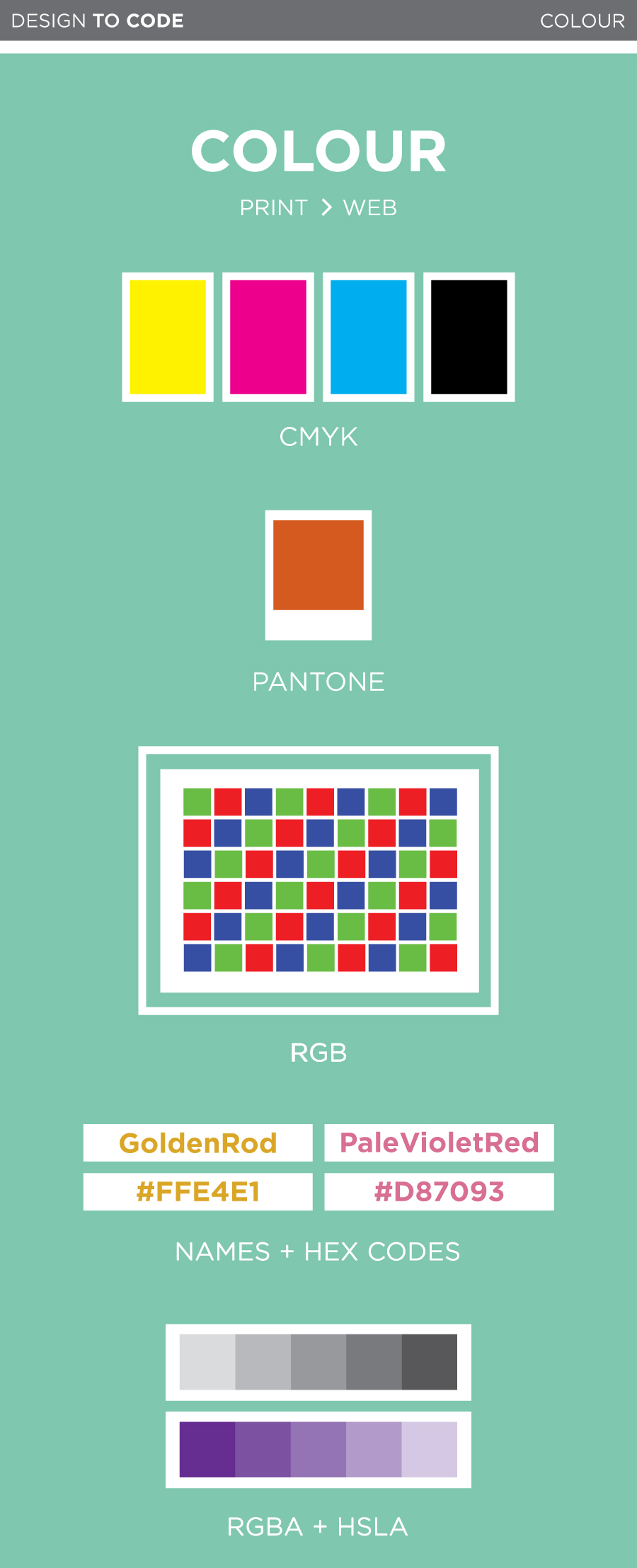
Most colour printing is done in CMYK; Cyan, Magenta, Yellow and Black. These colours are called process colours. Each of these four inks is stored on a separate tray in the printer and combined directly on the paper. Process colours can be printed in tints, ranging from solid to 0%. These tints are achieved by varying the density of tiny dots used in the printing process. Since processed colours are nearly transparent and you can create a large number of tints, it is extremely easy to create a super broad variety of hues.
Spot colours, also known as Pantones, are also very commonly used in the printing world. Unlike CMYK, which mixes a colour on the paper via layering, spot colours are custom pre-mixed colours. Think of Pantones like the big buckets of paint you would buy at Home Depot to paint your bedroom. They are pigments which have been specifically measured to create one very specific colour. Much like process colours, spot colours can also be printed at various tints.
Spot colours are often used for brand logos. An uncalibrated printer may not always print a processed colour exactly the same, but a spot colour will always be spot on. Get it, spot on? If your logo is made up of one spot colour and black it may be more affordable to print it as a two colour job, as opposed to four colour job (CMYK).
You know how sometimes you have something on your screen and then when you print it the colours look much duller or even darker? This is because screens don’t use CMYK so you can’t accurately predict what something will look like on paper. Unlike printers, who use physical ink, your computer screen uses light to display colour. All digital colours are defined through Red, Green and Blue, RBG. Similar to CMYK, RBG can be a solid or a tint, measured through the values 0 to 255 (255 showing the hue at its purest). When you go to print something make sure you change all your colours to CMYK since RBG can’t be printed on paper.
Keep in mind that every monitor will display colour differently, unfortunately there is no magic screen-colour-standard setting. If you are making the links on your website a very light grey you may want to test it out on a few screens. Your safest bet is to not go too light on anything important, as it may disappear on super bright screens.
 Dara says…
Like Alicia just mentioned, colour on the web works differently from colour in print. While most colours in print (aside from spot colours) are made by combining cyan, magenta, yellow and black inks, colours on computers are made by combining red, green and blue light together to create millions of different colours.
There are a few different ways to use colours on the web through CSS. First, let’s check out the old school ways:
Colour names
Did you know that CSS contains a bunch of preset colours that you can call on by name? Some of them are actually pretty nice!
Check these ones out:
PaleVioletRed
PaleTurquoise
MistyRose
Thistle
and OldLace
Using these colours is as simple as this:
.thing-youre-styling {
    color: MintCream; /* or background-color, or border-color */
}
You can check out the built-in CSS colours here.
Hex colours
These are probably the types of colours you’re most familiar with on the web. Hex colours are made up of six numbers — the first two are the red values, the second two are the green values, and the third two are the blue values, because, as Alicia explained, on-screen colours are made up of red, green and blue! RGB colours are measured from 0 (none of the colour) to 255 (the strongest intensity of the colour), and the Hex codes values, which are are written in hexadecimal, go from 00 (0) to FF (255). That’s why pure black is #000000 (none of any colour) and pure white is #FFFFFF (since red, green and blue light combined make white).
Here’s are the colours we looked at before as hex codes:
#D87093
#AFEEEE
#FFE4E1
#D8BFD8
and #FDF5E6
Unlike the predefined CSS colour words, the colours you can make with hex codes are nearly limitless. Well, to be precise, there are exactly 16,777,216 different colours (256 red values x 256 green values x 256 blue values).
A little side note about “web safe colours”
It’s the year 2014, and amazingly, I still sometimes hear people talking about “web safe colours”. Back in the ’90s, many monitors would support only 256 colours, so to make sure that your colours would show up properly on people’s screens, you had to stick to an extremely limited (and slightly unfortunate-looking) colour palette. Nowadays, almost all screens support millions of colours, so the idea of “web safe colours” is no longer a thing. Whew!
Transparency on the web and newer colour formats
Hex colour codes are kind of hard to remember. What if there was a colour format that just used the RGB values from 0 to 255 in a straightforward way?
Oh, hey, there is!
You can also declare your colours like this:
.thing-youre-styling {
    background-color: rgb(175, 238, 238);
}
This is pretty intuitive – the three values, like before, stand for red, green and blue, with each of them being a number from 0 to 255.
Modern browsers let you add a fourth value for transparency, which is pretty handy, and that’s called RGBa. The transparency value is between 0 and 1, with 0 being completely transparent, and 1 being completely opaque. That looks like this:
.thing-youre-styling {
    background-color: rgba(175, 238, 238, 0.3);
}
I’m a background with RGB colour
And I’m using RGBa with the exact same colour. Translucent goodness!
The new, cool kid on the block: HSLa
Hex colours, RGB, and RGBA all use the same model to declare a colour: R, G, and B values from 0 to 255. What if there was a new, cool way?
Oh, hey, there is!
HSLa is really different. It accepts four values:
H is for hue. This is a number from 0 to 360 (think of it like degrees of a circle)
S is for saturation. This is a percentage from 0% to 100%.
L is for lightness. This is a percentage from 0% to 100%, where 0 is black and 100 is white.
A is for transparency, just like in RGBa. This is a number between 0 and 1.
To wrap your head around HSLa, check out this HSL Color Picker. This lets you change all the colour values on the fly, and it also returns the hex and RGB colours. RGBa and HSLa are supported in every modern browser so feel free to start using them! If you’re still supporting IE8, you can use a fallback to a hex or RGB value.
Now go forth and make some awesome colours!
