New Year, New Post, New Poster

Hello, world! I haven’t posted here for a while, but now it’s a new year, and I heard a rumour that new years can involve starting things afresh. Things like blogs. I’m not really into making resolutions, but if I were, I’d definitely resolve to update my blog as often as humanly possible.

Speaking of the new year, I rang in 2009 at C’est What, a restaurant/bar/all around cool place in downtown Toronto. Pool, poutine, and awesome people were involved, so it was a really good time.
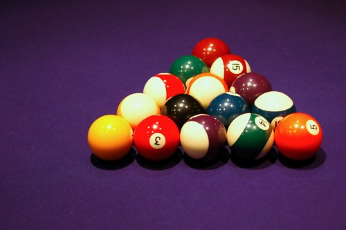
Pool Balls
Every time I see a pool table I think of The Music Man. Anyone with me?

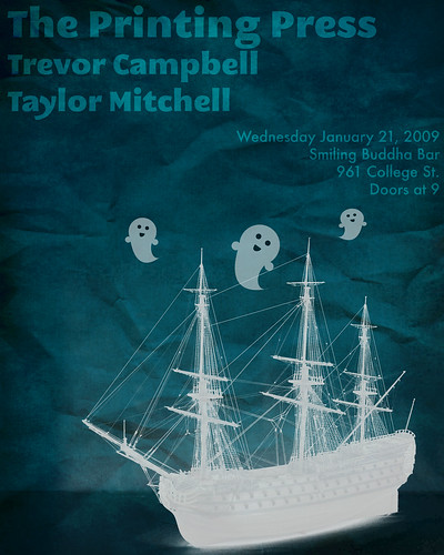
On another note, I’ve already completed my first poster design of 2009, and I’d like to share it with you!

New year, new poster

For this poster, I used both Adobe Photoshop and Adobe Illustrator.  In the past I was more of an exclusively-Photoshop kind of girl, but nowadays I really do like Illustrator a lot.  If you couldn’t tell, I created the happy ghosts in Illustrator.  I love vector images (which is what you’re creating in Illustrator) because you can blow them up to any size and they retain their smooth edges.  This is because the images are actually based on mathematical formulae instead of pixels.  It seems that math has come in handy in the real world after all!

♥ Dara
Forgive me, blog, for I have sinned.

It seems that I have completely abandoned my poor website!

Sorry, friends, readers, strangers, and bots that are perusing my site!  I’ll chalk it up to starting school and settling into a new routine.  If you don’t know, I am taking Graphic Design courses at a certain college in Toronto.  They’re definitely interesting!

Here is another poster that I created a little while back:

Printing Press Poster #3

One positive thing that I can say about design school is that I will never take computers for granted again!  Most of our work is done by hand, so we draw thumbnails by hand, collage by hand, and draw fonts by hand (!!).  Crazy stuff!

♥ Dara.

Another Printing Press Poster Design

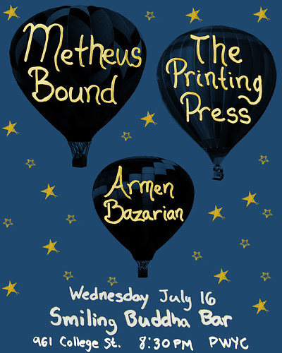
Smiling Buddha Poster 1

Here is another poster that I designed for a Printing Press show earlier this summer. I made this poster long before the last one I posted. In retrospect, I should have posted this one first and the other one second. Shhh, don’t tell anyone!

♥ Dara.

Printing Press Poster Design

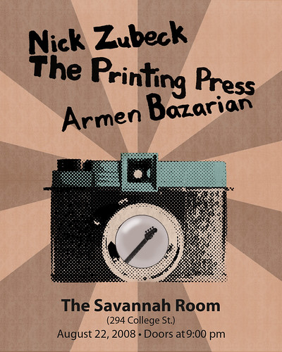
Hello, Internets!  Sorry I’ve been a bit absent lately.  This September I’m starting graphic design courses, and lately I’ve been practising my skills.  My most recent project was to design a concert poster for The Printing Press for their show on August 22.  I have to admit that I often have trouble pulling random ideas out of the air, so I went with a motif that was close to my heart:  cameras!  I actually don’t own a Diana camera myself, but I like the way they look and the weird, dreamy, crappy-but-cool images that they tend to produce.

Poster 2

Since I was to create a concert poster and not a camera show advertisement, I put a little something, also known as a (bass) guitar, in the camera lens.  I also had fun with the halftone look of the camera.  I’m really interested in learning more about screenprinting, and I’ve always liked the aesthetics of something that’s been printed in overt, visible halftone.  I plan on experimenting with that more in the future, hopefully culminating in learning how to screenprint for reals.  In the meantime, I print my own stuff (t-shirts mostly) by stencilling, and I’ll write more about those projects in an upcoming post.

Painting: Restless Slumber

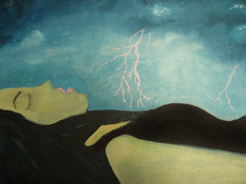
New painting:  Restless Slumber

I finished this painting a couple of days ago. Acrylic paint + pink ink pen on canvas.

Don’t worry, our protagonist is not dead (despite her greenish look), but only sleeping!
She appears to be dreaming about something quite intense. Maybe about shiny pink lightning bolts.

(Also, another way that I intended the painting was for the woman in it to blend into the landscape, her body appearing as a sort of mountain range – but you can read it as you please.)

♥ Dara.