Creating a workspace you love with… an art wall!

If I’m going to be spending hours at a time working away in one place every single day, I want to really like it. For better or for worse, I spend a lot of time at my desk in my ‘home office’ (doesn’t that sound fancy and grown up?), and after having worked in some pretty hideous setups (some of my own old rooms included), I can confidently report that I’m way more happy and productive when I’m in a space that I actually like. (Crazy, right?) With that in mind, I decided to walk you through how I made my workspace into one that I actually enjoy.

While buying new furniture can be expensive and a little heart-wrenching, it’s pretty easy to make your walls awesome with minimal pain and hassle. Here’s what mine looks like, in all its Instagrammed glory:
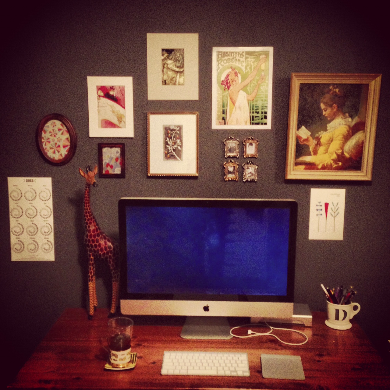
art-wall-ig

And here are the steps to put one together yourself!

1. Paint your wall an awesome color

As a designer, I am contractually obligated to tell you that colour is, like, totally important. In all seriousness, though, the wall colour totally dictates a room’s look, feel, and atmosphere, so picking one you like can really improve how you perceive your workspace. When we moved into this apartment, the wall was a colour that I quickly named Poopy Grey:
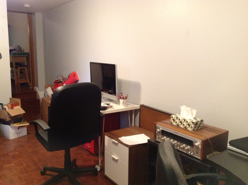
It took hours and hours to properly stage this beautiful shot.

It took hours and hours to properly stage this beautiful shot.

Although this particular shade of light grey might be someone else’s favourite colour (maybe the last tenant’s?), it wasn’t my style at all, so it had to go. I decided to paint this wall a nice dark grey because I found it both dramatic and calming, and so that any art would stand out nicely against it. The rest of the walls in the room are white, which a) helps the one dark wall seem more prominent and b) keeps me from feeling like I’m working in a cave. The colour I chose is Benjamin Moore’s Gray. I was a little disappointed that it didn’t have a fancier name, but you can’t always get what you want.

2. Gather awesome art that makes you happy!

This is by far the most fun step, and you can do this all at once, or gradually over time. I definitely took the latter approach — I’ve been collecting art and prints since I was in high school. This is totally not surprising at all given that I studied art history, but you definitely don’t need academic training to know what you like! It’s nice to build up a bit of a ‘collection’ over time and then pick and choose which pieces go up on your walls. Let me walk you through the art I chose to feature:
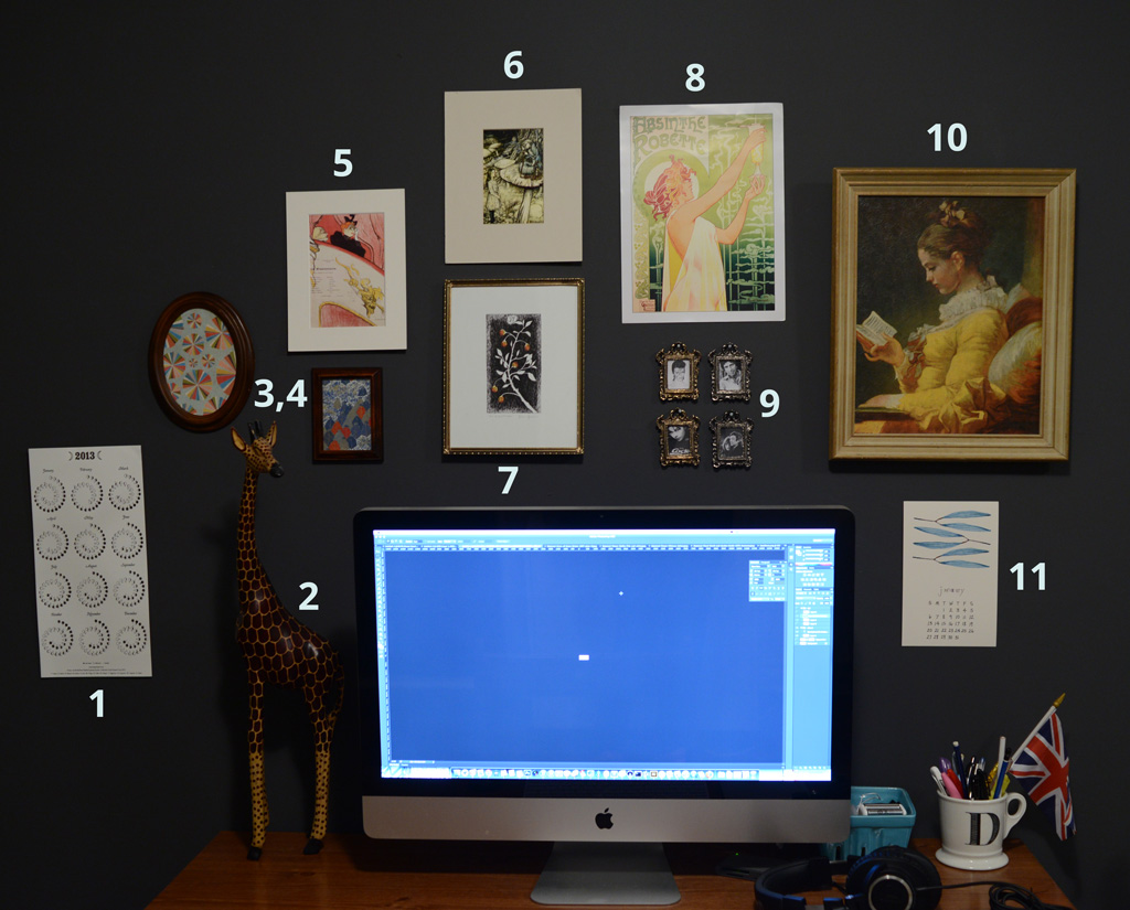
wall-numbered

  1. 2013 lunar calendar by Margins Imprint that I bought at a bookstore in Brooklyn this October
  2. Mr. Giraffe! He’s been with me through three apartments now. I acquired him one summer at the CNE.
  3. This is actually just a piece of (awesome) paper that I bought at The Paper Place on Queen St. West (which is totally worth a visit if you’re from Toronto and haven’t yet been).
  4. This one, too!
  5. Small print of a poster by Toulouse-Lautrec. I got it in Amsterdam of all places.
  6. An Alice in Wonderland print, which I embarrassingly found at a university poster sale.
  7. Tarot card print from The Wild Unknown.
  8. Art Nouveau print that I bought from a little stall on the Seine in Paris. I almost didn’t buy it because I already had a zillion other clichéd, stereotypical French prints, but this one was too awesome to pass up.
  9. I “borrowed” these frames from my grandmother’s basement. In it are black and white pictures of some of my musical heroes: David Bowie, Leonard Cohen, Björk, and Serge Gainsbourg + Jane Birkin. I was feeling a little nostalgic about being a teenager with tons of band posters on my walls and wanted to bring that back, but in a slightly less tacky way.
  10. This reproduction of A Young Girl Reading by Fragonard was procured at a super fancy shop called Value Village. Maybe you’ve heard of it?
  11. Lovely monthly calendars by Bookhou.

Other sources include sites like Etsy and local craft shows. For example, I’ve seen tons of great art at City of Craft in Toronto. You can check out Andrea Jaggs‘ recap to see what I mean! Supporting local and independent artists is awesome because it’ll give you warm, fuzzy feelings as well as ensure that some of your pieces are unique.

3. Figure out the arrangement before you hang it

Like so:
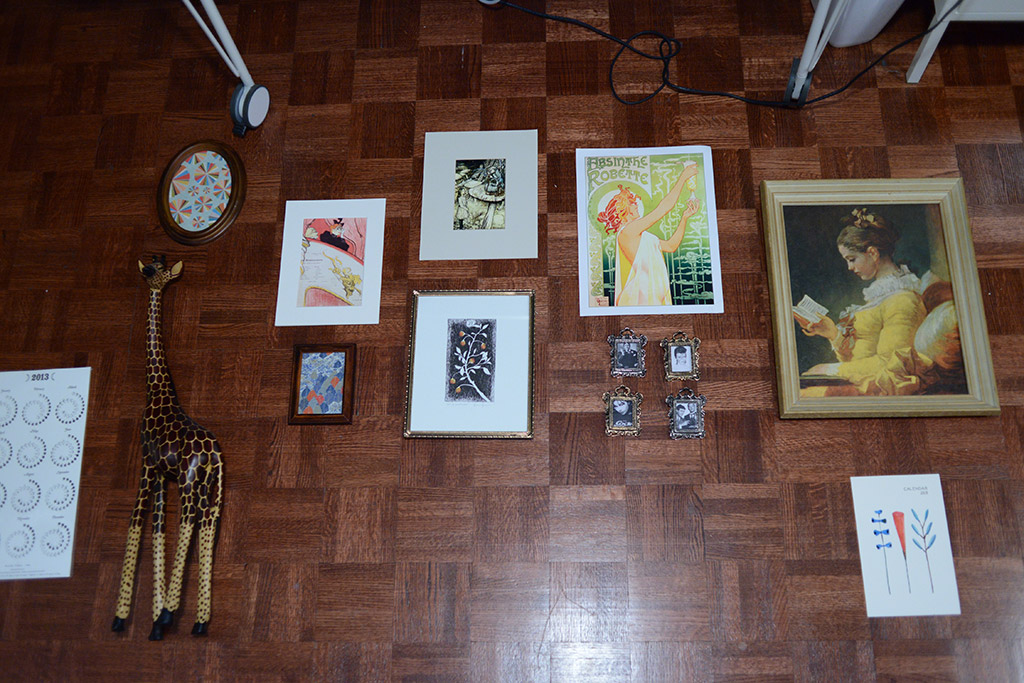
artwall-placement

And make sure to take a picture (or two) so you can replicate it later.

4. Put up decoys for placement

Like so:
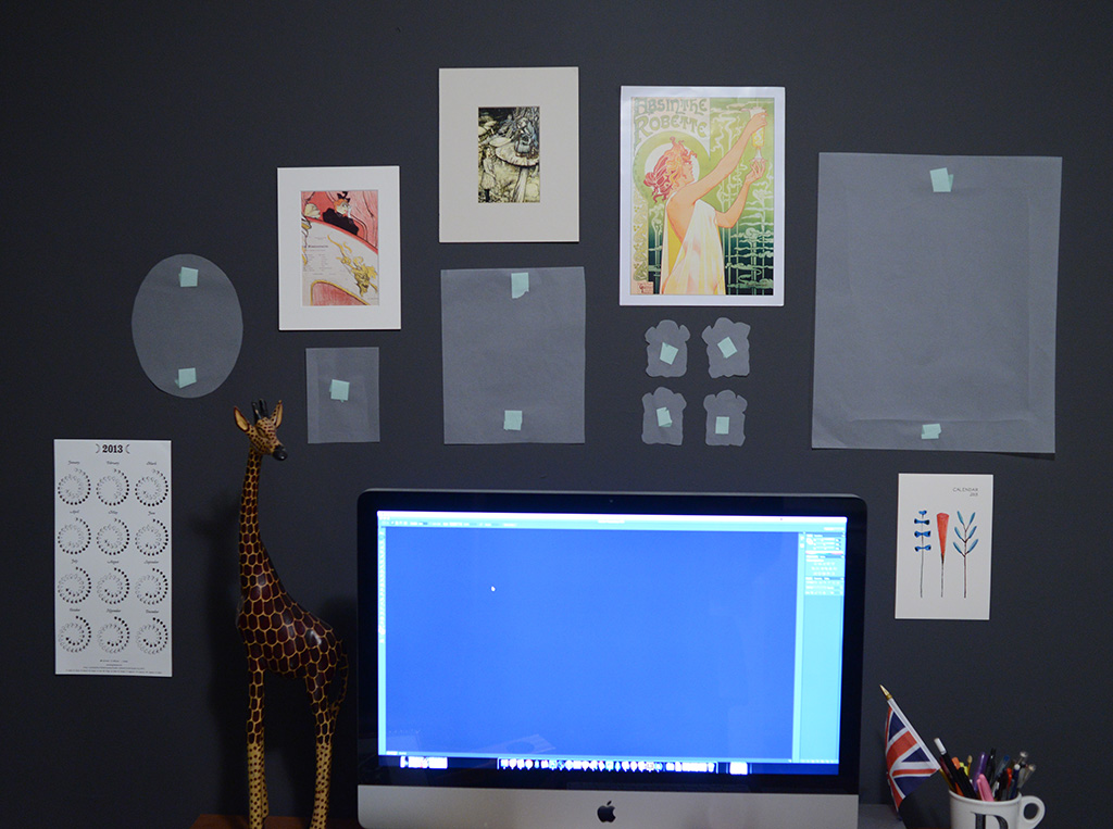
I thought this bright idea was original, until I was informed that it's been all over Pinterest for ages. So much for that.

I thought this bright idea was original, until I was informed that it’s been all over Pinterest for ages. So much for that.

Hammering a bunch of nails into your wall is a bit of a commitment, so going through this step helps you arrange things exactly as you like. I taped all of the light, frameless prints straight to the wall using painters’ tape and used paper decoys for the framed pieces.

5. Hang your art

Optional: drive yourself crazy by attempting to use a level.
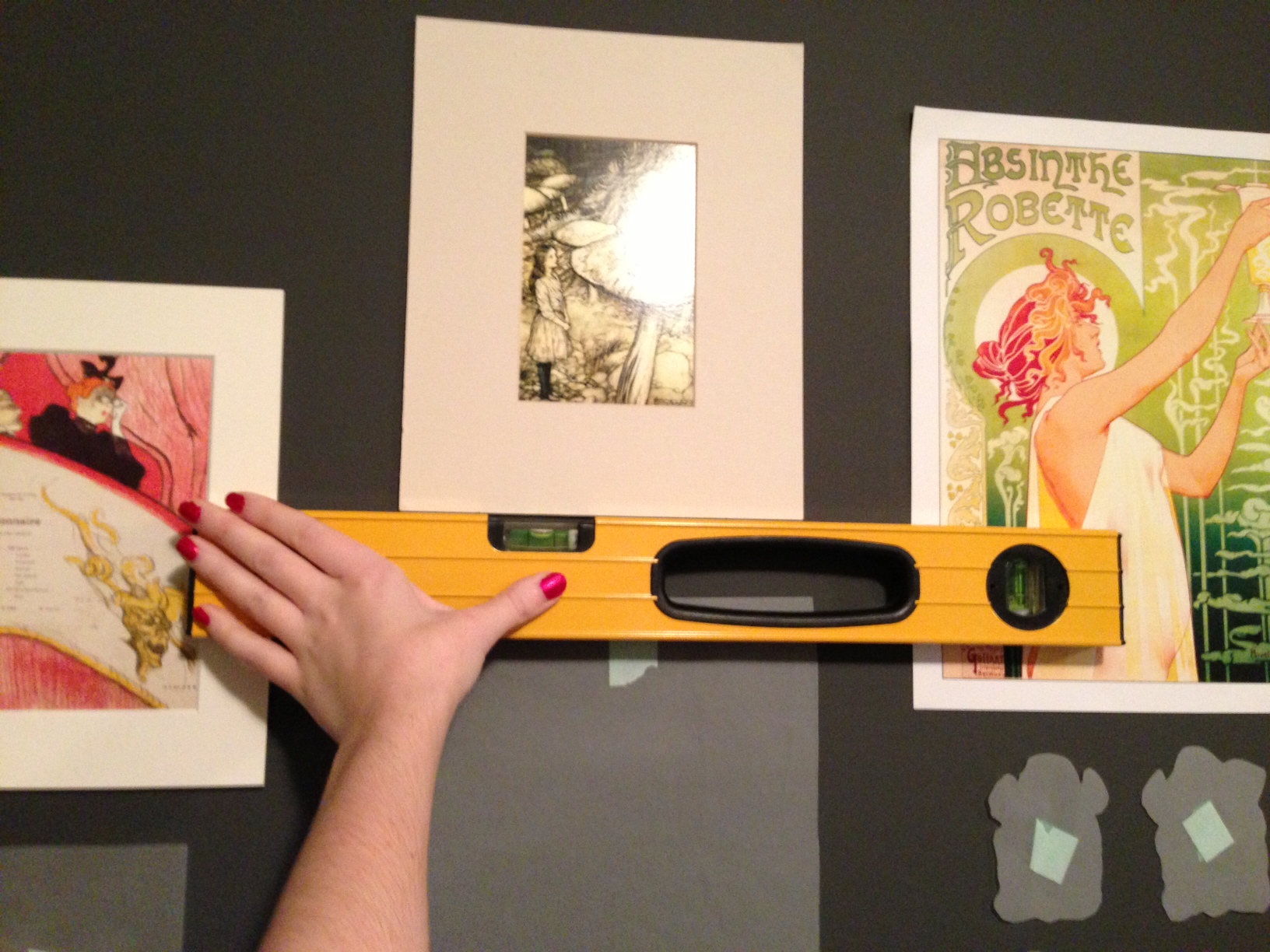
artwall-level

6. Enjoy!

How do you like to decorate your favourite spaces and make them feel like your own? Let me know!
Delving deeper into design, or, how design and I broke up and got back together again

When I first became interested in graphic design, I thought my love was one that would last forever. After all, it combined my favourite things: art, words, and a healthy dose of strategic thinking. After completing a fun but fairly useless degree in art history (focusing on 17th century Dutch art — so practical and relevant to life!), the world of design seemed refreshingly practical and contemporary. And thanks to our good friend the Internet, access to great design has never been easier.

But sadly, somewhere along the way I started to become disenchanted. I started to feel like design trends were far more prevalent than good design thinking. I found myself completely overwhelmed by all the CSS galleries, “inspiration” blog posts, Dribbble shots, and Pinterest boards in the world. After a while it seemed like most design communities (be it graphic design, interior design, or web design) were, let’s be honest, a bit same-ish. And don’t get me wrong, I have absolutely nothing against designers sharing their work or work that they like In fact, I think it’s great when people share! It’s just that the volume of visual information and sameness all seemed to be too much. I slowly felt myself becoming disenchanted with design culture.

Lately, though, I’ve been finding my way back. Here are some things that have helped:

Drastically limiting “inspiration”

I know that this might come as a shock to all the Pinterest lovers out there, but I honestly can’t deal with inspiration overload. I just can’t. I find that after seeing so many pretty images, they all start looking the same, and I don’t find myself caring about any of them. There are two main issues that I have with inspiration overload:

  1. There’s way too much pretty stuff out there, and you can spend so much time looking at it that you don’t actually do anything yourself. It seems that we’re living in a time where making original work and “curating content” are both seen as equally creative activities, and I find this a little problematic. Admiring the pretty is fun and even quite useful in moderation, but in excess it can waste a lot of time that might be better spent actually doing something.
  2. Admiring design only on a purely aesthetic level without any context can also be harmful since it ignores all of the strategic thinking and decision making that led to the final product. It also perpetuates surface-level trends that inevitably start to pop up in places for no reason other than that they’re popular. Now, I’m not immune to trends and I don’t think that trends are all bad! It’s nice sometimes to feel like your work captures the spirit of its time. What I don’t like is seeing the same style being thoughtlessly applied over and over again when it’s not really a good choice. This also applies very much to web design. It’s so tempting at the start of a project to browse endlessly through CSS galleries to get ‘inspired’, but this is not usually the best approach.

Reading some books (sometimes even paper ones)

If you know me well, you know I like to talk a lot about context. (I know, I’m such an exciting conversationalist!) Maybe it’s the former history student in me, but I can’t help seeing cultural artifacts as being very dependent on their time and their place (and on a multitude of other factors). So, naturally, I appreciate design far more when I understand where it’s coming from.

Given our current cultural fascination with retro-/‘vintage’-inspired design, it can be really fascinating to open up a design history book and read about how these aesthetics came to be. When you learn about a design movement in its historical context (there I go again with my favourite word), you begin to realize that what you once thought was purely visual might actually have a lot of meaning. Understanding a bit about the intersection of design and the culture in which it exists can really help to make intelligent and informed choices when you find yourself borrowing from a particular style. Colour, typography, images, and patterns can have very strong political/cultural meanings (depending on their… wait for it… context!), and it’s never a good experience when you accidentally give off a message that you didn’t intend. Reading a bit about art and design history can also help you to understand how something that seems boring or overdone now might have been completely revolutionary in its own time. (Context!)

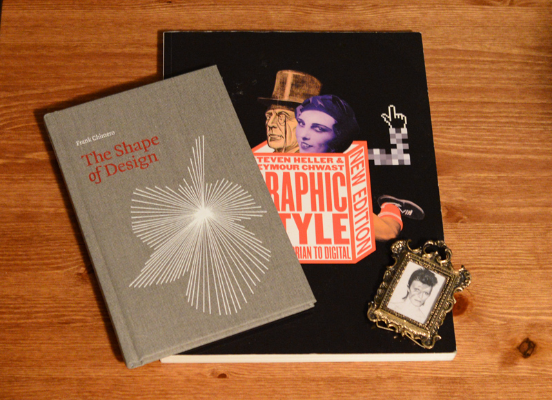
A couple of book recommendations: Graphic Style: From Victorian to Digital by Steven Heller and Seymour Chwast is a nice intro to the last couple of hundred years of graphic design. As a bonus, it’s really image-heavy, so you’re not slogging through a wall of text about something that’s inherently visual anyway. I also really enjoyed The Shape of Design by Frank Chimero. I’m not entirely sure how to sum it up since it’s a bit abstract, but I really liked that it was more philosophical than practical, and it got me a lot more excited about design thinking than I had been in a while.

A couple of books and… David Bowie? How did YOU get there?

Putting graphic design in its place

Last week when I was out buying a jar of honey, I couldn’t decide between the various brands in front of me. Instead of picking the one with the nicest label, I instead decided, as an experiment, to buy the one with the hideous Comic Sans label. Not too shockingly, the honey was still sweet and tasty despite its unsexy label.

LE GASP

I’ve come to realize that although branding is very important, it’s both contextual and complementary to the other facets that make up a brand. For example, I’m pretty sure that even the most iconic of logos (say, the Nike swoosh or the Apple logo) probably wouldn’t be iconic — really, they’d probably be totally forgotten — if they weren’t associated with amazing companies. Good branding and graphic design can really help (and I do mean a lot), but in the end, they aren’t the only things that matter. It helps me keep perspective to remember that good design is just one cog in a great machinery.


Note: Oh, noes! This post was long overdue, wasn’t it? I usually try to post here about once a week, but I recently got super sick and it completely knocked me out. I’m back now, though! Hurray!

Have a cute squirrel for your patience:

I took this picture today. This squirrel was totally irritated and yelling at something for a good ten minutes. It was amazing.

Being ‘unique’ is overrated, anyway

I used to think that my “unique” hobbies made me a bit of a special snowflake.

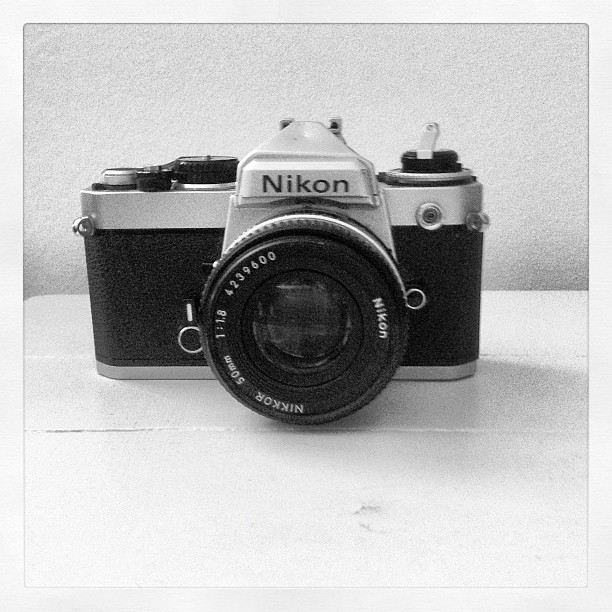
It’s laughable now, but when I was in high school, I was one of the only people I knew who owned a camera. It was a clunky 3-megapixel point-and-shoot that’s of course entirely obsolete today, but I loved that thing like you wouldn’t believe. That Canon A70 and I had a special bond; we understood each other. I was really proud of the fact that I’d bought it with my own money, and even prouder that I also knew how to use Photoshop enough to edit my photos.

I loved taking and editing photos, but I also secretly liked knowing that I had an interest in and an aptitude for something that most people my age didn’t really care much about at the time. I also felt similarly about knowing HTML. Let me tell you, 10-15 years ago, knowing how to code wasn’t at all cool, trendy, or even on most people’s radars (especially, let’s be honest, if you were a girl). So, regardless of how good I actually was, I could feel pretty proud of myself for exploring all of this “uncharted territory” (as I felt it was at the time).

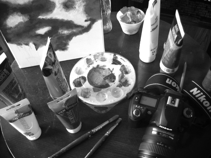
Now, let’s fast forward to today. Not only does almost everyone have a camera in their phone, but apps like Instagram have become ubiquitous. Taking stylized photos is now something that everybody does. Digital SLRs are probably now owned by more new parents and pet owners than by professional photographers. Graphic design, which similarly used to be the domain of a small group of specialists, has also risen to prominence in popular culture in a similar way. In the age of Pantone accessories and Pinterest boards, it’s easy to argue that our culture cares more about design (at least on a very surface level) than ever before.

I took this picture with Instagram. So meta.

So how did I feel when I realized that I wasn’t such a special snowflake anymore? I’ll be honest – I was slightly annoyed at first. Now, the very things that I thought made me unique turned out not to be so unique after all. I had to examine my relationship with my skills and interests to see what I really wanted to get out of them. In time, I’ve come to realize a couple of things:

  • When you’re genuinely into something, it shouldn’t really matter how many other people share your interest. It’s kind of like when someone obnoxiously stops listening to a band they claimed to love the instant that band becomes popular. I mean, really. Did they ever actually like the music? The same goes for a niche interest that suddenly explodes. If you truly like what you’re doing, popularity or lack thereof shouldn’t make a huge difference. It will probably make some difference, honestly, but if it totally puts you off, maybe it’s a sign that you weren’t so into it in the first place.
  • Now that your formerly obscure pastime has been taken over by just about everybody, just showing up isn’t enough. Now, you actually have to be good to be recognized as an expert (or, really, as someone who’s even proficient) in your field. Feeling like an expert requires a lot more effort than it used to, especially when you have a whole Internet of people to compare yourself to. This can be both motivating and overwhelming. On good days, I settle on realizing that I’ll likely never be the best person in the world at anything, but letting all the talented people in the world motivate me to do better and better.

Interests, pastimes, and professions are a lot deeper than they first appear. Most people, myself obviously included, do things for a variety of reasons. We don’t just choose our hobbies for how they make us feel, but also for how they make us look. We don’t live in a vacuum, and a lot of our choices are dictated by how we think we’ll be perceived by others in the context of our culture and peer groups. The bitterness that some people feel when their previously obscure interest becomes popular really highlights this. I’m not judging that bitterness too harshly, since I think it’s a natural (human, imperfect) reaction. This kind of discomfort can actually be really interesting, since it shines light on our motivations, which usually sit, unnoticed, under the surface.

Learning to love constraints

Nothing makes me freeze up like starting a new creative project with absolute freedom to do whatever I want.

This might sound a bit strange. After all, isn’t creativity about thinking outside the box and about coming up with something new? Aren’t art and freedom of expression inextricably linked?

Well, yes and no. I used to think that truly creative individuals (as opposed to phonies like myself) created and invented effortlessly out of thin air. I figured that for the truly creative, making something from nothing is second nature, and since I always found staring down a blank canvas to be incredibly daunting, I must not actually be a creative person. No matter how much people would compliment my work, I always felt deep down like I was faking it, and I was terrified that someone would eventually find out.

Then I started to meet other creative people. I started to read articles and blog posts by artists I admired. It began to dawn on me that my experience and fear weren’t all that unique. Many artists, writers, designers, and even non “creative” people were experiencing the same feelings. I found some consensus that:

  • Starting a project is often the hardest part, and,
  • People are often at their most creative when working within a set of pre-defined boundaries.

I’d guess that different people require different types and amounts of boundaries. For me, they’re almost essential to getting anything done. This is why, for example, I’ve always felt more comfortable writing essays with an established topic than writing fiction. This is why when interior decorators are trying to decide what colour to paint a room, they’ll often build a palette around an object from the room. Without making some choices before starting out, possibilities are too limitless. I recently read about the “paradox of choice”: that people are often far happier when they have to choose between 3 options, for example, as opposed to 30. We feel stifled when we have no freedom to make creative choices, but completely overwhelmed when the options are limitless. Part of growing as an artist is discovering where that mythical balance lies (for yourself – I’d guess that it’s in a different place for each person).

This balance is part of what led me to favour design over art (at least most of the time). I’m at my best when I’m constrained by a set of problems – once I have issues to tackle, I can get to work and come up with interesting solutions. This isn’t to say that I don’t see value in making art – in fact, I love it (when it happens). I’m just more successful when I make a few choices in advance and let things go from there.

So, if you feel like a big faker because ideas don’t come easily to you in the beginning, don’t worry. It happens to everyone most people (OK, I’m sure there are some people who are naturally that good… jerks). Try imposing some boundaries on yourself and see what happens.

P.S. This post was inspired by the fact that I started this blog with too few constraints on myself. I mean, isn’t it great that I could have a space where I could write whatever the hell I want? Well, as it turns out… no.