When I first became interested in graphic design, I thought my love was one that would last forever. After all, it combined my favourite things: art, words, and a healthy dose of strategic thinking. After completing a fun but fairly useless degree in art history (focusing on 17th century Dutch art — so practical and relevant to life!), the world of design seemed refreshingly practical and contemporary. And thanks to our good friend the Internet, access to great design has never been easier.
But sadly, somewhere along the way I started to become disenchanted. I started to feel like design trends were far more prevalent than good design thinking. I found myself completely overwhelmed by all the CSS galleries, “inspiration” blog posts, Dribbble shots, and Pinterest boards in the world. After a while it seemed like most design communities (be it graphic design, interior design, or web design) were, let’s be honest, a bit same-ish. And don’t get me wrong, I have absolutely nothing against designers sharing their work or work that they like In fact, I think it’s great when people share! It’s just that the volume of visual information and sameness all seemed to be too much. I slowly felt myself becoming disenchanted with design culture.
Lately, though, I’ve been finding my way back. Here are some things that have helped:
Drastically limiting “inspiration”
I know that this might come as a shock to all the Pinterest lovers out there, but I honestly can’t deal with inspiration overload. I just can’t. I find that after seeing so many pretty images, they all start looking the same, and I don’t find myself caring about any of them. There are two main issues that I have with inspiration overload:
- There’s way too much pretty stuff out there, and you can spend so much time looking at it that you don’t actually do anything yourself. It seems that we’re living in a time where making original work and “curating content” are both seen as equally creative activities, and I find this a little problematic. Admiring the pretty is fun and even quite useful in moderation, but in excess it can waste a lot of time that might be better spent actually doing something.
- Admiring design only on a purely aesthetic level without any context can also be harmful since it ignores all of the strategic thinking and decision making that led to the final product. It also perpetuates surface-level trends that inevitably start to pop up in places for no reason other than that they’re popular. Now, I’m not immune to trends and I don’t think that trends are all bad! It’s nice sometimes to feel like your work captures the spirit of its time. What I don’t like is seeing the same style being thoughtlessly applied over and over again when it’s not really a good choice. This also applies very much to web design. It’s so tempting at the start of a project to browse endlessly through CSS galleries to get ‘inspired’, but this is not usually the best approach.
Reading some books (sometimes even paper ones)
If you know me well, you know I like to talk a lot about context. (I know, I’m such an exciting conversationalist!) Maybe it’s the former history student in me, but I can’t help seeing cultural artifacts as being very dependent on their time and their place (and on a multitude of other factors). So, naturally, I appreciate design far more when I understand where it’s coming from.
Given our current cultural fascination with retro-/‘vintage’-inspired design, it can be really fascinating to open up a design history book and read about how these aesthetics came to be. When you learn about a design movement in its historical context (there I go again with my favourite word), you begin to realize that what you once thought was purely visual might actually have a lot of meaning. Understanding a bit about the intersection of design and the culture in which it exists can really help to make intelligent and informed choices when you find yourself borrowing from a particular style. Colour, typography, images, and patterns can have very strong political/cultural meanings (depending on their… wait for it… context!), and it’s never a good experience when you accidentally give off a message that you didn’t intend. Reading a bit about art and design history can also help you to understand how something that seems boring or overdone now might have been completely revolutionary in its own time. (Context!)
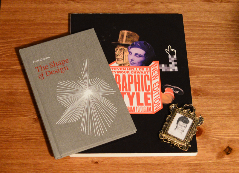
A couple of book recommendations: Graphic Style: From Victorian to Digital by Steven Heller and Seymour Chwast is a nice intro to the last couple of hundred years of graphic design. As a bonus, it’s really image-heavy, so you’re not slogging through a wall of text about something that’s inherently visual anyway. I also really enjoyed The Shape of Design by Frank Chimero. I’m not entirely sure how to sum it up since it’s a bit abstract, but I really liked that it was more philosophical than practical, and it got me a lot more excited about design thinking than I had been in a while.

A couple of books and… David Bowie? How did YOU get there?
Putting graphic design in its place
Last week when I was out buying a jar of honey, I couldn’t decide between the various brands in front of me. Instead of picking the one with the nicest label, I instead decided, as an experiment, to buy the one with the hideous Comic Sans label. Not too shockingly, the honey was still sweet and tasty despite its unsexy label.

LE GASP
I’ve come to realize that although branding is very important, it’s both contextual and complementary to the other facets that make up a brand. For example, I’m pretty sure that even the most iconic of logos (say, the Nike swoosh or the Apple logo) probably wouldn’t be iconic — really, they’d probably be totally forgotten — if they weren’t associated with amazing companies. Good branding and graphic design can really help (and I do mean a lot), but in the end, they aren’t the only things that matter. It helps me keep perspective to remember that good design is just one cog in a great machinery.
Note: Oh, noes! This post was long overdue, wasn’t it? I usually try to post here about once a week, but I recently got super sick and it completely knocked me out. I’m back now, though! Hurray!
Have a cute squirrel for your patience:

I took this picture today. This squirrel was totally irritated and yelling at something for a good ten minutes. It was amazing.

