Bubbles & Business

bubblePhoto: Serge Melki / Flickr

A lesson I’ve learned over and over again, both in business and in life, is that most people really don’t care about the particulars of what I do every day.

It’s really easy to forget this. When you hang out mostly with your peers, it’s so easy, not to mention satisfying, to get lost in talking shop. But when you’re active in any community (be it the design community, the online entrepreneur community, or whatever group(s) you feel that you’re a part of), it’s really important to keep in mind that you’re in a bubble and that most of the world doesn’t think like you and doesn’t care about the details that you find really fascinating.

Now, don’t get me wrong; it’s really fun being in a bubble of peers! It’s nice and comfy in that place where most people will agree with your opinions and share your grievances. There’s a lot to be learned from people similar to you, and surrounding yourself with peers can really deepen your knowledge on a given topic. I know that I often learn a ton when I hang out with other designers, developers, and business owners.

But for a lot of us, a large part of our audience exists far outside our bubbles. For business owners especially, people come to us because we have an expertise that they don’t. If people cared about the details that we did, they most likely wouldn’t need our services.

Reminding myself that I’m sometimes living too far inside certain bubbles helps me to remember to communicate the value of what I do to other people who don’t necessarily speak my language. I’ve learned the consequences of not doing this first hand, since I’ve been in conversations where I see people’s eyes glazing over as I talk about my work. So tragic, right? But, really, I have to take some, if not full, responsibility when this happens.

The world belongs to those who know how to frame the importance of their offerings to people outside of their bubbles, and not necessarily to those who are the best at their craft. No, the world’s unfortunately not a pure meritocracy, but when you get communication and skill together… then the magic really happens.

Design to Code: Colour 101

Design to Code is a collaborative blog column where awesome graphic designer Alicia Carvalho will teach you about a design concept and related tips, tricks or resources, and then I’ll tell you how it can be applied to the web. This week is all about colour!

dtc_colours

Alicia says…

Let’s talk about colour! I believe everyone is familiar with the basics of colour wheels so I will jump right in and explain how colour works in design from a printing perspective, how it translates onto the screen and then Dara will continue the online exploration.

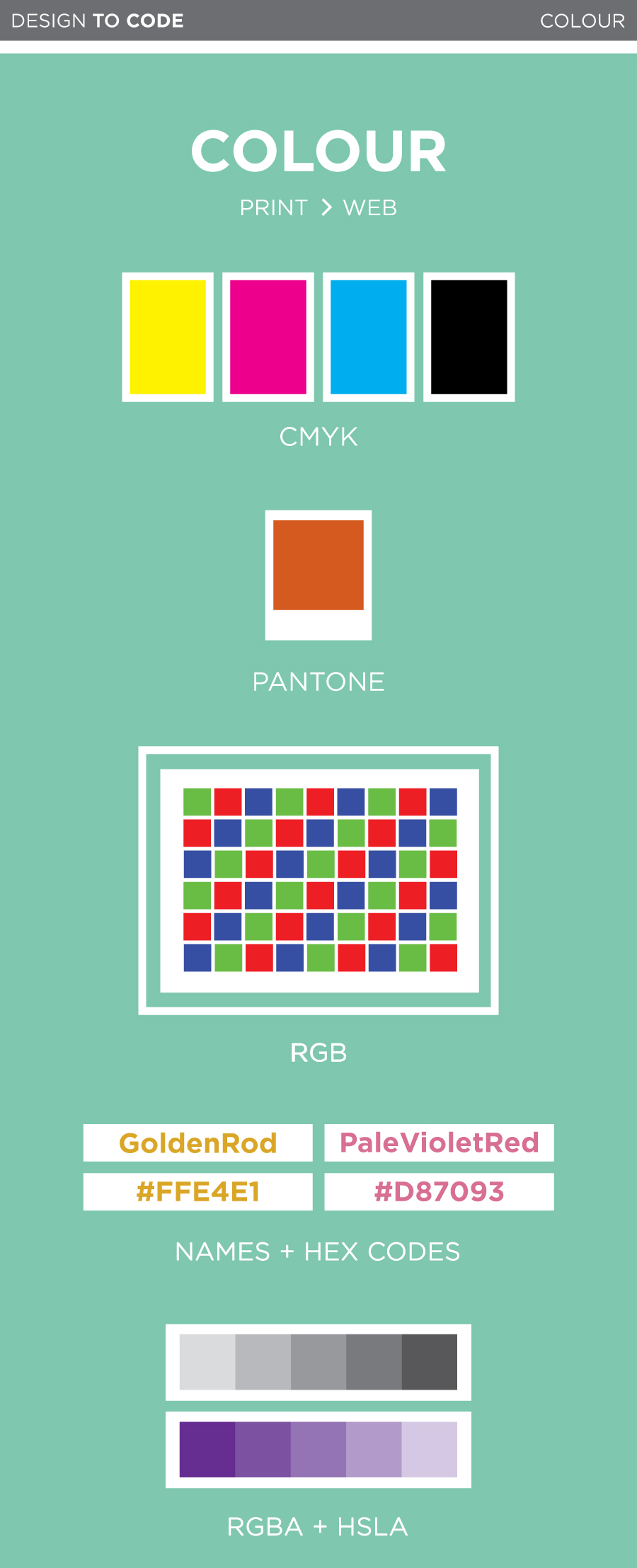
Most colour printing is done in CMYK; Cyan, Magenta, Yellow and Black. These colours are called process colours. Each of these four inks is stored on a separate tray in the printer and combined directly on the paper. Process colours can be printed in tints, ranging from solid to 0%. These tints are achieved by varying the density of tiny dots used in the printing process. Since processed colours are nearly transparent and you can create a large number of tints, it is extremely easy to create a super broad variety of hues.

Spot colours, also known as Pantones, are also very commonly used in the printing world. Unlike CMYK, which mixes a colour on the paper via layering, spot colours are custom pre-mixed colours. Think of Pantones like the big buckets of paint you would buy at Home Depot to paint your bedroom. They are pigments which have been specifically measured to create one very specific colour. Much like process colours, spot colours can also be printed at various tints.

Spot colours are often used for brand logos. An uncalibrated printer may not always print a processed colour exactly the same, but a spot colour will always be spot on. Get it, spot on? If your logo is made up of one spot colour and black it may be more affordable to print it as a two colour job, as opposed to four colour job (CMYK).

You know how sometimes you have something on your screen and then when you print it the colours look much duller or even darker? This is because screens don’t use CMYK so you can’t accurately predict what something will look like on paper. Unlike printers, who use physical ink, your computer screen uses light to display colour. All digital colours are defined through Red, Green and Blue, RBG. Similar to CMYK, RBG can be a solid or a tint, measured through the values 0 to 255 (255 showing the hue at its purest). When you go to print something make sure you change all your colours to CMYK since RBG can’t be printed on paper.

Keep in mind that every monitor will display colour differently, unfortunately there is no magic screen-colour-standard setting. If you are making the links on your website a very light grey you may want to test it out on a few screens. Your safest bet is to not go too light on anything important, as it may disappear on super bright screens.

feJlNDY5_biggerDara says…

Like Alicia just mentioned, colour on the web works differently from colour in print. While most colours in print (aside from spot colours) are made by combining cyan, magenta, yellow and black inks, colours on computers are made by combining red, green and blue light together to create millions of different colours.

There are a few different ways to use colours on the web through CSS. First, let’s check out the old school ways:

Colour names

Did you know that CSS contains a bunch of preset colours that you can call on by name? Some of them are actually pretty nice!

Check these ones out:

PaleVioletRed
PaleTurquoise
MistyRose
Thistle
and OldLace

Using these colours is as simple as this:

.thing-youre-styling {
    color: MintCream; /* or background-color, or border-color */
}

You can check out the built-in CSS colours here.

Hex colours

These are probably the types of colours you’re most familiar with on the web. Hex colours are made up of six numbers — the first two are the red values, the second two are the green values, and the third two are the blue values, because, as Alicia explained, on-screen colours are made up of red, green and blue! RGB colours are measured from 0 (none of the colour) to 255 (the strongest intensity of the colour), and the Hex codes values, which are are written in hexadecimal, go from 00 (0) to FF (255). That’s why pure black is #000000 (none of any colour) and pure white is #FFFFFF (since red, green and blue light combined make white).

Here’s are the colours we looked at before as hex codes:

#D87093
#AFEEEE
#FFE4E1
#D8BFD8
and #FDF5E6

Unlike the predefined CSS colour words, the colours you can make with hex codes are nearly limitless. Well, to be precise, there are exactly 16,777,216 different colours (256 red values x 256 green values x 256 blue values).

A little side note about “web safe colours”

It’s the year 2014, and amazingly, I still sometimes hear people talking about “web safe colours”. Back in the ’90s, many monitors would support only 256 colours, so to make sure that your colours would show up properly on people’s screens, you had to stick to an extremely limited (and slightly unfortunate-looking) colour palette. Nowadays, almost all screens support millions of colours, so the idea of “web safe colours” is no longer a thing. Whew!

Transparency on the web and newer colour formats

Hex colour codes are kind of hard to remember. What if there was a colour format that just used the RGB values from 0 to 255 in a straightforward way?

Oh, hey, there is!

You can also declare your colours like this:

.thing-youre-styling {
    background-color: rgb(175, 238, 238);
}

This is pretty intuitive – the three values, like before, stand for red, green and blue, with each of them being a number from 0 to 255.

Modern browsers let you add a fourth value for transparency, which is pretty handy, and that’s called RGBa. The transparency value is between 0 and 1, with 0 being completely transparent, and 1 being completely opaque. That looks like this:

.thing-youre-styling {
    background-color: rgba(175, 238, 238, 0.3);
}

I’m a background with RGB colour

And I’m using RGBa with the exact same colour. Translucent goodness!

The new, cool kid on the block: HSLa

Hex colours, RGB, and RGBA all use the same model to declare a colour: R, G, and B values from 0 to 255. What if there was a new, cool way?

Oh, hey, there is!

HSLa is really different. It accepts four values:

H is for hue. This is a number from 0 to 360 (think of it like degrees of a circle)
S is for saturation. This is a percentage from 0% to 100%.
L is for lightness. This is a percentage from 0% to 100%, where 0 is black and 100 is white.
A is for transparency, just like in RGBa. This is a number between 0 and 1.

To wrap your head around HSLa, check out this HSL Color Picker. This lets you change all the colour values on the fly, and it also returns the hex and RGB colours. RGBa and HSLa are supported in every modern browser so feel free to start using them! If you’re still supporting IE8, you can use a fallback to a hex or RGB value.

Now go forth and make some awesome colours!

Reflections on a year of pricing projects

9062011476_fc223a2f90_b

Pricing your products or services can be pretty hard, right? I’m guessing that most self-employed people can relate to this, especially at the beginning of their careers. How much is too little? Too much? Do you charge an hourly rate? A fixed rate based on estimated time? A fixes rate based on value? Of course, as we all know deep down, there are no clear answers to these questions, and everyone does things a little bit differently anyway.

I’ve been running my business full time for almost a year now (!) so I’ve had a bit of time to try different things. After accumulating almost year of data on pricing my projects, I finally put it all together last week and analyzed it by taking each project and comparing how much time I estimated it would take, how long it actually took, how much I charged, and how much I really made per hour I worked on it.

What I found… was a little surprising.

First, a brief note on how I priced my projects this past year

About a year before I went full-time, I started to use fixed pricing based on time instead of billing by the hour, which is how I started off. That means that I would imagine how long the project would take, multiply it by an appropriate hourly rate, and that would be the price. If a project took less time than I’d anticipated, hurray! If it took more time, then oh well, my fault for estimating poorly.

This past year, I took a fairly similar approach, but with a couple of refinements. Instead of scoping each project from scratch, I created an internal price sheet to save myself some time when quoting similar projects, and I used a multiplier for complexity. When I got the sense that some projects would be more challenging than others (for whatever reason), I bumped up my quote, knowing that they were likely to take more of my time and energy. At this point I’m really interested in value based pricing, and am currently working on implementing that in my business.

And now, my main takeaways

Track your time like your life depends on it

When you’re charging fixed prices, tracking your time can feel like frivolous pain in the ass. But, if you don’t, you won’t have the proper data to refine your business practices, and every pricing change you make will be based on guesses. That’s no good! When I worked at Jet Cooper, I was sometimes a little lax about my time tracking, and I feel badly about it now that I understand how important it is. SORRY, GUYS!

I use a really simple app called TimeKeeper, which lets me tag every time entry both by project and by task type. It’s almost perfect for my purposes, aside from the fact that it doesn’t sync to Dropbox automatically. C’mon, TimeKeeper devs! Get on it! (Plz?)

Coding my own designs takes way less time than coding someone else’s

I take on two main types of projects: full websites (design and development) and development only. When I was putting my price list together, I came up with base prices for design and base prices for development, which seemed to make sense at the time. This means that I was scoping developing my own designs exactly the same way I scoped developing other people’s designs.

BIG MISTAKE!

After “crunching the numbers”, as they say, I found out that sites I designed and developed sometimes earned up to three times more per hour worked than developing sites by other designers. That, friends, was pretty shocking, though when I think about it, it really shouldn’t have been. I didn’t take the additional complexity of working with another person into consideration, and I didn’t think about the fact that I would never design something that I knew was impossible (or just irritating) to code, so I would never be putting myself in a difficult development situation. If that wasn’t enlightening enough, I then found out that…

The least fun projects were generally the most lucrative

Wait, what?!

This really surprised me when I saw this pattern, but then I thought about it for 5 seconds and realized that it actually makes a bunch of sense. I think we all have a tendency to overestimate the time and difficulty of something we’re not as enthusiastic about, and underestimate the things that sound like fun. Though this is a totally natural thing to do, it essentially means that we’re rewarding ourselves for taking on projects that we’re not too fond of. That’s a little backwards, isn’t it? Oops!

In conclusion…

When you’re running your own business, every day is an opportunity to learn something! Also… track your damn time.

Design to Code: Serif vs Sans Serif

preview_serifvssansserif

Hey, everyone! After getting lots of positive feedback on our Design to Code column concept last week (thanks! we really appreciate it!), we’re excited to be posting our first installment this week! We decided to start with the very basics and talk typography, beginning with serif versus sans serif fonts (plus some other basics about how to embed fonts and where to find them, so if you’re a beginner, this one will be perfect for you).

This one is posted over on Alicia’s blog, so check it out!

Introducing… Design to Code!

Happy Wednesday, everyone!

I’m excited to announce that I’ll be collaborating with awesome graphic + web designer Alicia Carvalho on a new blog column called Design to Code. Every few weeks, Alicia will teach you about a design term and some related tips, tricks or resources, and then I’ll tell you how this design concept can be applied on the web.

dtc-logo

We’ll be taking turns posting the column on our blogs, so make sure to follow both Alicia’s blog and mine to get each instalment and learn how to improve your designs and apply your new skills to your own website!