New Year, New Post, New Poster

Hello, world! I haven’t posted here for a while, but now it’s a new year, and I heard a rumour that new years can involve starting things afresh. Things like blogs. I’m not really into making resolutions, but if I were, I’d definitely resolve to update my blog as often as humanly possible.

Speaking of the new year, I rang in 2009 at C’est What, a restaurant/bar/all around cool place in downtown Toronto. Pool, poutine, and awesome people were involved, so it was a really good time.

Pool Balls
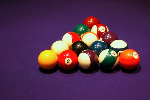
Every time I see a pool table I think of The Music Man. Anyone with me?

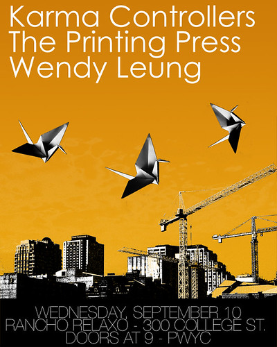
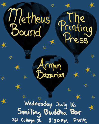
On another note, I’ve already completed my first poster design of 2009, and I’d like to share it with you!

New year, new poster

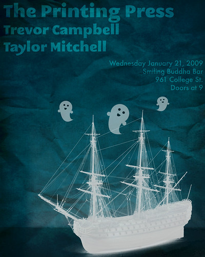
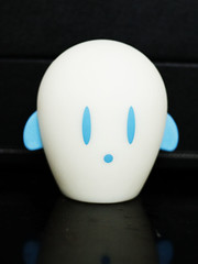
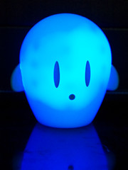
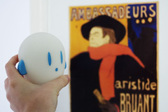
For this poster, I used both Adobe Photoshop and Adobe Illustrator.  In the past I was more of an exclusively-Photoshop kind of girl, but nowadays I really do like Illustrator a lot.  If you couldn’t tell, I created the happy ghosts in Illustrator.  I love vector images (which is what you’re creating in Illustrator) because you can blow them up to any size and they retain their smooth edges.  This is because the images are actually based on mathematical formulae instead of pixels.  It seems that math has come in handy in the real world after all!

♥ Dara

Forgive me, blog, for I have sinned.

It seems that I have completely abandoned my poor website!

Sorry, friends, readers, strangers, and bots that are perusing my site!  I’ll chalk it up to starting school and settling into a new routine.  If you don’t know, I am taking Graphic Design courses at a certain college in Toronto.  They’re definitely interesting!

Here is another poster that I created a little while back:

Printing Press Poster #3

One positive thing that I can say about design school is that I will never take computers for granted again!  Most of our work is done by hand, so we draw thumbnails by hand, collage by hand, and draw fonts by hand (!!).  Crazy stuff!

♥ Dara.

Photos: Colours of London

Very Red Café
Red: At a café in West Kensington.

The Headless Horseman :D
Green: A headless horseman! (ha ha :D)

Lord Nelson
Blue: Nelson’s column in Trafalgar Square

As some of you might know, I travelled to Europe (specifically, England, France, Italy, and the Netherlands) this past May and June. I am just starting to process the photos, and what a daunting task it’s proving to be! Digital photography is convenient and cost effective (no more wasted film!), but also opens up the possibility of taking thousands of pictures that you’ll never have time to edit. I’m really enjoying going back over the photos, though, because they remind me of my awesome trip that now feels like a crazy dream. I was only in London for two days (tragic!!!) so that part of the trip really did go by in a whirlwind! More travel pictures are available at my flickr.

♥ Dara.

Another Printing Press Poster Design

Smiling Buddha Poster 1

Here is another poster that I designed for a Printing Press show earlier this summer. I made this poster long before the last one I posted. In retrospect, I should have posted this one first and the other one second. Shhh, don’t tell anyone!

♥ Dara.

SPÖKA: The ghost with the most!

Since I started my blog with the intention of writing about all things art, design, and aesthetically pleasing, I figure that it must be appropriate to write a small homage to a new friend of mine that I picked up at IKEA this past weekend.

spoka-off

His official name is Spöka and I found him in the Kids’ section. He’s a rechargeable nightlight in the shape of an adorable ghost! He comes in three colours: blue, red, and green. Although red is my favourite colour, I opted for the blue one since he was the very cutest. I like design that’s not just functional, but creative and good looking as well.

spoka-on

Although IKEA is not to everyone’s taste, it’s one of my favourite places to spend a free afternoon. I love interior design and home decor! Strolling through the showrooms, I imagine what my future home will look like. I enjoy the mix of classy, kitschy, and downright tacky items for sale. I also find it amusing how design trends, much like everything else, are cyclical. When I was younger, I always used to make fun of a rather hideous lamp in my grandparents’ house that looked like it came right out of the ’60s or ’70s… that is, until I saw IKEA selling it as the “KNAPPA Pendant lamp”. Oops?!

Anyway, back to my new little friend. In the following picture, he comes face to face with one of my favourite artists – Toulouse-Lautrec!

spoka-toulouse

♥ Dara.