If you’ve ever had to communicate with someone about creating/resizing images for the web, I’ll bet you’ve heard a lot about “72 DPI”. As in, “images for the web should be 72 DPI while images for print should be at least 300 DPI”. You might even think it’s true.
Friends, I’m here to put the 72 DPI myth to rest.
If you’re sitting here thinking “WTF is DPI?” or “Is DPI the same as PPI?” or “Why, oh why, are there so many acronyms in the world?”, DPI stands for “dots per inch”, and PPI stands for “pixels per inch”. The term DPI is generally used for printed images since printed images are made up of tiny dots, while the term PPI is mostly used for screens, since screens contain pixels. They’re quite similar, and people often use them interchangeably, which is a little confusing, so don’t worry about it for now. Let’s think of them interchangeably for our purposes.
Now, let me show you three images from Placekitten, aka the best site ever. One is at 72 DPI, one is at 300 DPI, and one is at 1000 DPI:

72 DPI

300 DPI

1000 DPI
Don’t believe me? Download them and open them in Photoshop. Take your time. I’ll be here!
Craziness! How could this be?
All you have to do is look back to what the acronym actually stands for: pixels/dots per inch. This refers to how many pixels/dots are squeezed into one inch of space on a printed page. Two images with the same pixel value (let’s say, 1000 pixels wide) will print at very different sizes depending on the set DPI. That image at 72 DPI will be 13.88 inches wide, while that same image at 300 DPI will be 3.33 inches wide. It’s just basic math. All DPI does is determine how many pixels your printer is going to cram into one inch of space on the page. That’s why a higher DPI image looks better than a lower DPI image – the more pixels you squeeze into a small area, the finer the detail in your printed image.
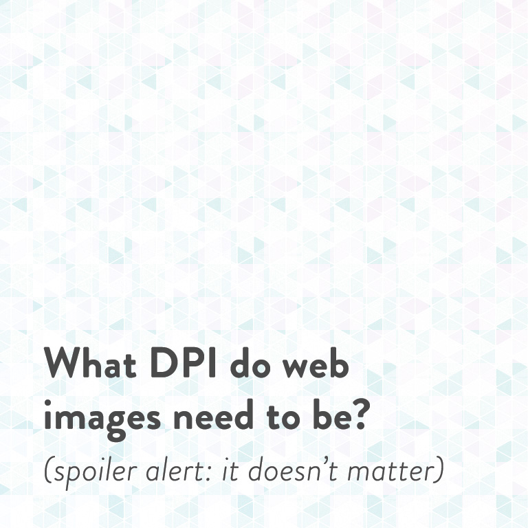
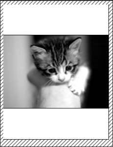
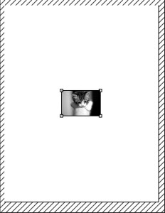
Remember the three images I showed you above with different DPI values that look exactly the same on the web? Here’s what they’d look like printed:
72 DPI
300 DPI
1000 DPI
Ahhh, so image DPI does matter… but only if you’re printing it out.
So, how does this relate to the web, again?
Trick question – it doesn’t. Look back up again at the three original kitties – their size doesn’t change at all on your screen, because your screen understands one measurement: pixels. Pixels are all you ever need to think about. To determine how big an image should be on your website, you have to know what size in pixels it needs to fill. Your designer/developer should tell you something like “please make sure that images for this particular section of your website are X pixels wide.” The target size of your image is determined by the size of the container it needs to fill, and that measurement is different from website to website (or even in different parts of the same website), so the person who created your website (or your theme documentation, if you’re using a pre-made theme) will be able to tell you what size you should be aiming for. In pixels. Just pixels.
Hey, what about retina displays?
Glad you asked! Retina displays, also known as “high DPI” displays, are awesome in that they cram more pixels into their screens than standard displays. This means that each individual pixel is even smaller so you get a much sharper image than on a standard screen. So doesn’t image DPI matter now? Doesn’t it?
Nope. All you really need to know is that if you’re optimizing for a retina display that’s squishing double the number of pixels into the same area as a non-retina display would, you need to double the pixels in your image so it still appears crisp. So, a logo that’s 300px across normally should be saved at 600px. Then, when that image is presented at 300px as originally intended, it’ll look nice and crisp on retina screens since the image has double the number of pixels and so does the screen. The DPI/PPI setting in Photoshop is still irrelevant because you’re not printing it out.
If in doubt, remember that on the web, it’s all about the pixels. Unless you’re using a vector format like SVG, in which case, high five. You’re awesome.